TabPanelクラスはcardSwitchAnimationプロパティを利用することで、簡単にカード切り替えのアニメーションを作れます。
cubeアニメーションサンプル
fadeアニメーションサンプル
flipアニメーションサンプル
popアニメーションサンプル
slideアニメーションサンプル

cubeアニメーションを行うJavaScriptは次のとおりです。cardSwitchAnimationプロパティの値に'cube'が指定してあります。
index.js
なお、各カードのテキスト、背景色はCSS(cards.css)で指定しています。上記のindex.jsのcardsのitemsで指定しているカードオブジェクトのcls: 'card1'は、カードのCSSのクラスを指定しています。cards.cssには次のように書いてあります。
cards.css
index.htmlでは、sencha-touch.css、sencha-touch.jsそしてindex.jsに加えて、cards.cssを読み込む行が追加されています。
index.html
cubeアニメーションサンプル
fadeアニメーションサンプル
flipアニメーションサンプル
popアニメーションサンプル
slideアニメーションサンプル
cubeアニメーションを行うJavaScriptは次のとおりです。cardSwitchAnimationプロパティの値に'cube'が指定してあります。
index.js
Ext.setup({
onReady: function(){
var cards = [{
title: 'Photo 1',
html: 'Photo 1
 ',
cls: 'card1'
}, {
title: 'Photo 2',
html: '
',
cls: 'card1'
}, {
title: 'Photo 2',
html: 'Photo 2
 ',
cls: 'card2'
}, {
title: 'Photo 3',
html: '
',
cls: 'card2'
}, {
title: 'Photo 3',
html: 'Photo 3
 ',
cls: 'card3'
}],
var myPanel = new Ext.TabPanel({
fullscreen: true,
type: 'light',
cardSwitchAnimation: 'cube',
items: cards
});
}
});
',
cls: 'card3'
}],
var myPanel = new Ext.TabPanel({
fullscreen: true,
type: 'light',
cardSwitchAnimation: 'cube',
items: cards
});
}
});
なお、各カードのテキスト、背景色はCSS(cards.css)で指定しています。上記のindex.jsのcardsのitemsで指定しているカードオブジェクトのcls: 'card1'は、カードのCSSのクラスを指定しています。cards.cssには次のように書いてあります。
cards.css
 .card1, .card2, .card3 {
 text-align: center;
 color: #FF0000;
 text-shadow: #3F80CA 0 1px 0;
 font-size: 32px;
 padding-top: 10px;
}
 .card1 {
 background-color: #1CA9B0;
}
 .card2 {
 background-color: #4D824A;
}
 .card3 {
 background-color: #B8146E;
}
index.htmlでは、sencha-touch.css、sencha-touch.jsそしてindex.jsに加えて、cards.cssを読み込む行が追加されています。
index.html
<!DOCTYPE html>
<html>
<head>
    <meta http-equiv="Content-Type" content="text/html; charset=utf-8">
    <title>Tabs</title>

	<link rel="stylesheet" href="../../resources/css/sencha-touch.css" type="text/css">
	<link rel="stylesheet" href="cards.css" type="text/css">

	<script type="text/javascript" src="../../sencha-touch.js"></script>
	<script type="text/javascript" src="index.js"></script>

</head>
<body></body>
</html>
スマートフォンの特徴的なフィンガーアクションの1つスワイプ。Ext.Carouselクラスを使えば、スワイプでのページ遷移も簡単です。
サンプルを試す
index.js

サンプルを試す
index.js
Ext.setup({
onReady: function(){
var myToolbar = new Ext.Toolbar({
dock: 'top',
title: 'Ext.Carouselのテスト',
height: 40
});
var myCarousel = new Ext.Carousel({
direction: 'horizontal',
ui:'dark',
items: [
{html: 'photo A
photo B
photo C
これまでのスクリプトでは、パネルに配置するツールバー、ツールバーに載せるボタンのオブジェクトを汎用オブジェクトで作っていました。
正式には次のスクリプトで示すように、ツールバーはExt.ToolBarクラス、ボタンはExt.Buttonクラスでオブジェクトを作ります。
サンプルを試す
index.js
正式には次のスクリプトで示すように、ツールバーはExt.ToolBarクラス、ボタンはExt.Buttonクラスでオブジェクトを作ります。
サンプルを試す
index.js
Ext.setup({
 onReady: function(){
   var myFunc = function(obj, event){
    Ext.Msg.alert('Good Job!',obj.iconCls);
   },

   var btn1 = new Ext.Button();
   btn1.ui = 'round';
   btn1.text = 'compose';
   btn1.iconCls = 'compose';
   btn1.iconMask = true;
   btn1.handler = myFunc;

   var btn2 = new Ext.Button({
       ui: 'round',
       iconCls: 'trash',
       iconMask: true,
       handler: myFunc
     });

   var buttons = [btn1,btn2];

   var myToolbar = new Ext.Toolbar({
    dock: 'top',
    ui: 'light',
    items: buttons
   });

   var myPanel = new Ext.Panel({
     fullscreen: true,
     dockedItems: [myToolbar],
     html: 'Testing'
   });
 }
});
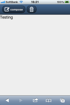
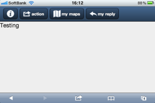
Sencha touchには標準で多くのボタンアイコンが揃っています。ボタンアイコンを使うにはiconClsプロパティでアイコンを指定し、iconMaskをtrueにします。次のサンプルではinfo、action、maps、replyのアイコンを使っています。
また、myFuncユーザー定義関数で2つの引数を受け取れるようにしています。第1引数には操作のターゲットとなったオブジェクトが渡り、第2引数にはイベントオブジェクトが渡されます。引数で受け取ったオブジェクトを利用してalertの文言を変えています。
*外部イメージファイルをアイコンに使うこともできます。
サンプルを試す
index.js
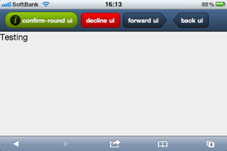
uiをconfirmにするとボタンは緑色、declineは赤色になります。forwardとbackでは方向を示すボタン形状になります。
サンプルを試す
index.js
また、myFuncユーザー定義関数で2つの引数を受け取れるようにしています。第1引数には操作のターゲットとなったオブジェクトが渡り、第2引数にはイベントオブジェクトが渡されます。引数で受け取ったオブジェクトを利用してalertの文言を変えています。
*外部イメージファイルをアイコンに使うこともできます。
サンプルを試す
index.js
Ext.setup({
 onReady: function(){
   var myFunc = function(obj, event){
    Ext.Msg.alert('Good Job!',obj.text+' , '+event.type);
   },

   var buttons = [{
              ui: 'normal',
              iconCls: 'info',
              iconMask: true,
              handler: function(){
               Ext.Msg.alert('Good Job!');
              }
            },
            {
              ui: 'normal',
              text: 'action',
              iconCls: 'action',
              iconMask: true,
              handler: myFunc},
            {
              ui: 'normal',
              text: 'my maps',
              iconCls: 'maps',
              iconMask: true,
              handler: myFunc},
            {
              ui: 'normal',
              text: 'my reply',
              iconCls: 'reply',
              iconMask: true,
              handler: myFunc
            }]

   var myPanel = new Ext.Panel({
     fullscreen: true,
     dockedItems: [
        {
          dock : 'top',
          xtype: 'toolbar',
          ui   : 'light',
          items: buttons
        }
      ],

     html: 'Testing'
   });
 }
});
uiをconfirmにするとボタンは緑色、declineは赤色になります。forwardとbackでは方向を示すボタン形状になります。
サンプルを試す
index.js
Ext.setup({
 onReady: function(){
   var myFunc = function(obj, event){
    Ext.Msg.alert('Good Job!',obj.text+' , '+event.type);
   },

   var buttons = [{
              ui: 'confirm-round',
              text: 'confirm-round ui',
              iconCls: 'info',
              iconMask: true,
              handler: myFunc},
            {
              ui: 'decline',
              text: 'decline ui',
              handler: myFunc},
            {
              ui: 'forward',
              text: 'forward ui',
              handler: myFunc},
            {
              ui: 'back',
              text: 'back ui',
              handler: myFunc
            }]

   var myPanel = new Ext.Panel({
     fullscreen: true,
     dockedItems: [
        {
          dock : 'top',
          xtype: 'toolbar',
          ui   : 'light',
          items: buttons
        }
      ],

     html: 'Testing'
   });
 }
});
先日のサンプルではクリックの応答にJavaScriptのalertメソッドを使いましたが、SenchaのMessageクラス(参照する場合はMsgと書くので注意!)にもalertメソッドがあります。
サンプルを試す
index.js
サンプルを試す
index.js
Ext.setup({
 onReady: function(){
   var myFunc = function(){
    Ext.Msg.alert('Good Job!','myFuncを実行しました。');
   },

   var buttons = [{
              ui: 'small',
              text: 'button1',
              handler: function(){
               Ext.Msg.alert('Good Job!');
              }
            },
            {
              ui: 'small',
              text: 'button2',
              handler: myFunc
            }]

   var myPanel = new Ext.Panel({
     fullscreen: true,
     dockedItems: [
        {
          dock : 'top',
          xtype: 'toolbar',
          ui   : 'light',
          items: buttons
        }
      ],

     html: 'Testing'
   });
 }
});
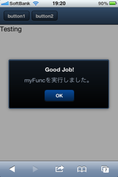
パネルに並べたボタンをタップすると関数が実行されるようにしましょう。タップイベントの応答はhandlerプロパティに設定します。
次のbutton1のhandlerにはfunctionステートメントが直接書いてあります。button2のhandlerではユーザー定義したmyFuncを実行します。
サンプルを試す
index.js
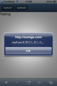
次のbutton1のhandlerにはfunctionステートメントが直接書いてあります。button2のhandlerではユーザー定義したmyFuncを実行します。
サンプルを試す
index.js
Ext.setup({
 onReady: function(){
   var myFunc = function(){
    alert('myFuncを実行しました。');
   },

   var buttons = [{
              ui: 'small',
              text: 'button1',
              handler: function(){
               alert('button1です。');
              }
            },
            {
              ui: 'small',
              text: 'button2',
              handler: myFunc
            }]

   var myPanel = new Ext.Panel({
     fullscreen: true,
     dockedItems: [
        {
          dock : 'top',
          xtype: 'toolbar',
          ui   : 'light',
          items: buttons
        }
      ],

     html: 'Testing'
   });
 }
});
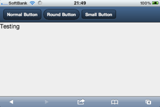
PanelクラスのdockedItemsに3個のボタンを並べます。ボタンはitemsプロパティに配列で指定します。normal、round 、smallの3つのスタイルのボタンです。スタイルはuiプロパティで指定します。
サンプルを試す
index.js
iPhoneでは画面縦向きだとボタンを全部表示できませんが、横向きにすれば入ります。画面の回転には自動で対応しているので回転に関するコードを書く必要はありません。
次のスクリプトではitemsで指定するボタンの配列をあらかじめ変数buttonsに入れています。
サンプルを試す
index.js
ボタンのスタイルには、action、forward、backという種類もあります。
サンプルを試す
index.js
サンプルを試す
index.js
Ext.setup({
 onReady: function(){

   var myPanel = new Ext.Panel({
     fullscreen: true,

     dockedItems: [
        {
          dock : 'top',
          xtype: 'toolbar',
          ui   : 'light',
          items: [
            {
              ui: 'normal',
              text: 'Normal Button'
            },
            {
              ui: 'round',
              text: 'Round Button'
            },
            {
              ui: 'small',
              text: 'Small Button'
            }
          ]
        }
      ],

     html: 'Testing'
   });
 }
});
iPhoneでは画面縦向きだとボタンを全部表示できませんが、横向きにすれば入ります。画面の回転には自動で対応しているので回転に関するコードを書く必要はありません。
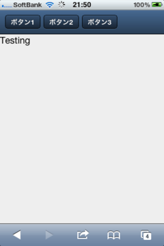
次のスクリプトではitemsで指定するボタンの配列をあらかじめ変数buttonsに入れています。
サンプルを試す
index.js
Ext.setup({
 onReady: function(){
   var buttons = [{
              ui: 'small',
              text: 'ボタン1'
            },
            {
              ui: 'small',
              text: 'ボタン2'
            },
            {
              ui: 'small',
              text: 'ボタン3'
            }],

   var myPanel = new Ext.Panel({
     fullscreen: true,
     dockedItems: [
        {
          dock : 'top',
          xtype: 'toolbar',
          ui   : 'light',
          items: buttons
        }
      ],

     html: 'Testing'
   });
 }
});
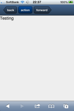
ボタンのスタイルには、action、forward、backという種類もあります。
サンプルを試す
index.js
Ext.setup({
 onReady: function(){
   var buttons = [{
              ui: 'back',
              text: 'back'
            },
            {
              ui: 'action',
              text: 'action'
            },
            {
              ui: 'forward',
              text: 'forward'
            }],

   var myPanel = new Ext.Panel({
     fullscreen: true,
     dockedItems: [
        {
          dock : 'top',
          xtype: 'toolbar',
          ui   : 'light',
          items: buttons
        }
      ],

     html: 'Testing'
   });
 }
});
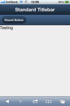
Panelクラスのプロパティをテストするサンプルです。Panelのインスタンスを作り、fullscreen、dockedItems、htmlの3つのプロパティの値を設定します。
dockedItemsには2個のオブジェクトが入っています。オブジェクトのxtypeを'toolbar'にするとツールバーになります。そしてuiを'light'にすると薄い色のツールバーになります。初期値は'dark'です。
ツールバーの中身はitemsオブジェクトで指定します。1番目のツールバーにはitemsオブジェクトがなく、代わりにtitleが設定してあります。2番目のitemsオブジェクトにはuiを'round'で指定した角丸ボタンが入っています。textだけを設定してuiを省略すると標準ボタンになります。
index.js
dockedItemsには2個のオブジェクトが入っています。オブジェクトのxtypeを'toolbar'にするとツールバーになります。そしてuiを'light'にすると薄い色のツールバーになります。初期値は'dark'です。
ツールバーの中身はitemsオブジェクトで指定します。1番目のツールバーにはitemsオブジェクトがなく、代わりにtitleが設定してあります。2番目のitemsオブジェクトにはuiを'round'で指定した角丸ボタンが入っています。textだけを設定してuiを省略すると標準ボタンになります。
index.js
Ext.setup({
 onReady: function(){

   var myPanel = new Ext.Panel({
     fullscreen: true,

     dockedItems: [
        {
          dock : 'top',
          xtype: 'toolbar',
          title: 'Standard Titlebar'
        },
        {
          dock : 'top',
          xtype: 'toolbar',
          ui   : 'light',
          items: [
            {
              ui: 'round',
              text: 'Round Button'
            }
          ]
        }
      ],

     html: 'Testing'
   });
 }
});
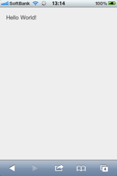
まずはHello World!から。
sencha-touch.cssとsencha-touch-debug.jsは、SenchaサイトからダウンロードしたSencha touch1.0の中に入っています。
index.html
index.js
sencha-touch.cssとsencha-touch-debug.jsは、SenchaサイトからダウンロードしたSencha touch1.0の中に入っています。
index.html
 <!DOCTYPE html>
  <html>
  <head>
    <meta http-equiv="Content-Type" content="text/html; charset=utf-8">
     <title>hello world1</title>
	 <!-- Sencha Touch CSS -->
	 <link rel="stylesheet" href="../../resources/css/sencha-touch.css" type="text/css">
	 <!-- Sencha Touch JS -->
	 <script type="text/javascript" src="../../sencha-touch-debug.js"></script>
	 <!-- Application JS -->
	 <script type="text/javascript" src="index.js"></script>
 </head>
 <body></body>
</html>
index.js
Ext.setup({
	onReady: function(){
		var panel = new Ext.Panel({
            fullscreen: true,
            styleHtmlContent:{
              'padding':'10px'
            },
            html:'Hello World!'
        });
	}
});


